Most Important Features Exploratory Data Analysis
Contents
Histogram
and claims partial dependency
Histogram
and claims partial dependency
Histogram
and claims partial dependency
Histogram
and claims partial dependency
Histogram
and claims partial dependency
Histogram
and claims partial dependency
Losses
mean plot with error bars
Losses
mean plot with error bars
Losses
mean plot with error bars
Losses
mean plot with error bars
Introduction
R and Python code and output:
-
EDA.0.
Classification - Preparing Dataset for Frequency Feature Importance
-
EDA.1.
Feature Importance from XGB Classification
-
EDA.2.
Severity - Preparing Dataset for Gamma Distribution Feature Importance
-
EDA.3.
Severity - Feature Importance from XGB Gamma Distribution
-
EDA.4.
Severity - Preparing Dataset for Normal Distribution Feature Importance
-
EDA.5.
Severity - Feature Importance from XGB Regression
-
EDA.7
Frequency - Visualization_Final
- EDA.8 Severity - Visualization
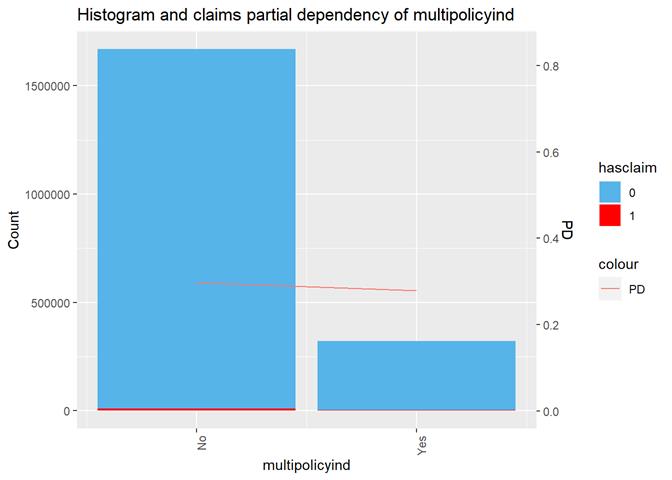
The attributes were selected based on the visual analysis, correlation, and numerous runs of XGBoost and GLM models. The model run was done on training data set and the decision was made based on the testing dataset model score. An attribute was added in the list of selected if it has consistent dependency in each method (visual analysis, XGBoost and in GLM, if applicable, models). E.g. significant increasing or decreasing claim rate based on the same input category or values. As an example of the exclusion from this rule is multipolicyind. It`s visible different in the charts with higher claims rate in ``No`` category but there is slightly higher claim rate in XGBoost partial dependency and non-significant at all in a GLM model. As a result, the attribute has the lowest score in XGBoost and contradictive Shap Values.
Misc Visualization
Frequency
Severity
Frequency
The cross_plot shows how the input
variable is correlated with the target variable, getting the likelihood rates
for each input's bin/bucket
The bayesian_plot shows how the input variable is correlated with the target variable, comparing with a bayesian approach the posterior conversion rate to the target variable. It`s useful to compare categorical values, which have no intrinsic ordering (not ordered).
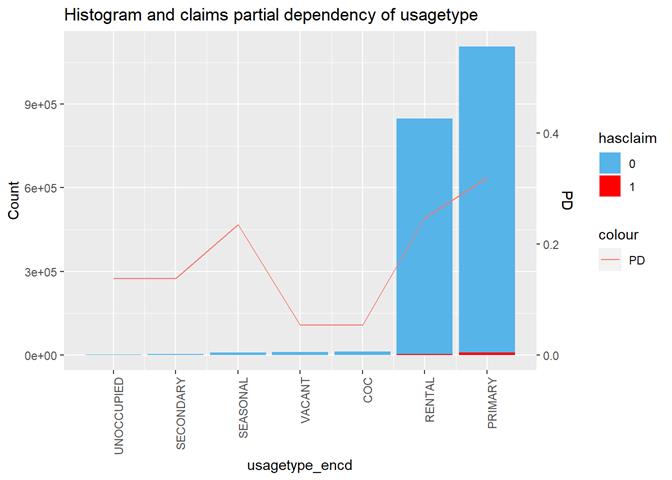
The third type of plots is the combination a bar-plot with the number of observations in each group, filled with the number of observations with claims and partial dependency plot from XGBoost classification.
For continuous attribute the most informative is a box-plot and partial dependency plot. The other plots are used to check if the distribution is close to the normal.
Since there are very few exposures with more then 1 claim, in this stage of analysis I use hasclaim (0/1 or No/Yes) attribute as the target instead of the real number of claims per exposure.
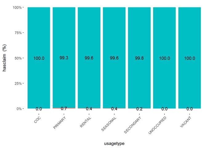
Usagetype
|
PRIMARY |
7 |
|
|
RENTAL |
6 |
|
|
COC |
5 |
|
|
VACANT |
4 |
|
|
SEASONAL |
3 |
|
|
SECONDARY |
2 |
CovADDRR_SecondaryResidence is included if Yes |
|
UNOCCUPIED |
1 |
|
The more property is used, the higher claims rate.
Cross Plot
Histogram and claims partial dependency
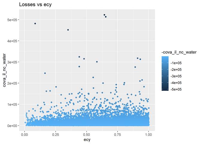
Ecy (exposure calendar year)
The longer the exposure, the higher claim rate.
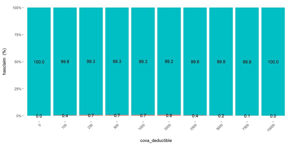
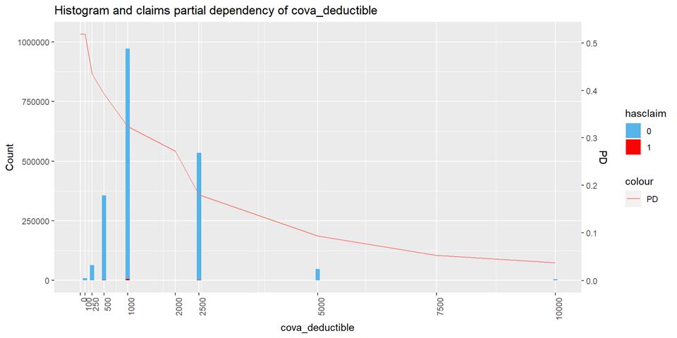
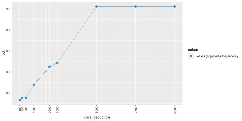
CovA Deductible
The claim rate is higher in low deductible policies.
Cross Plot
Histogram and claims partial dependency
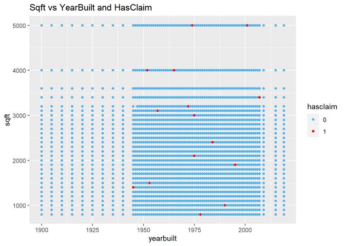
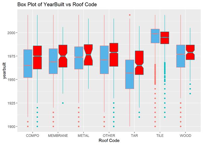
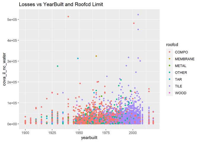
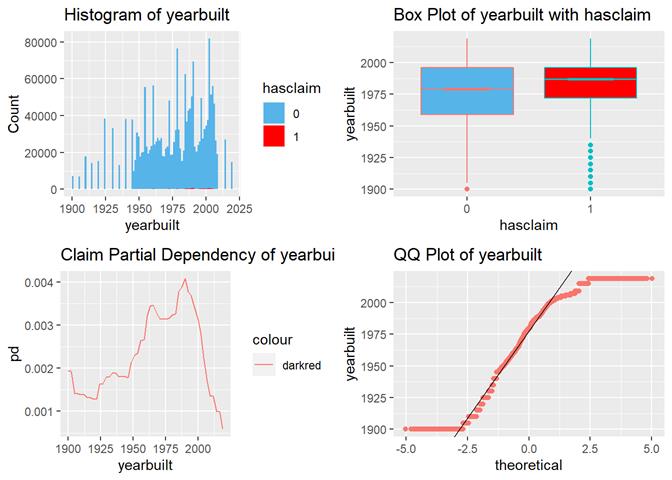
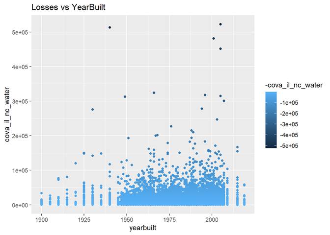
Yearbuilt
More claims are in newer houses but not in modern.
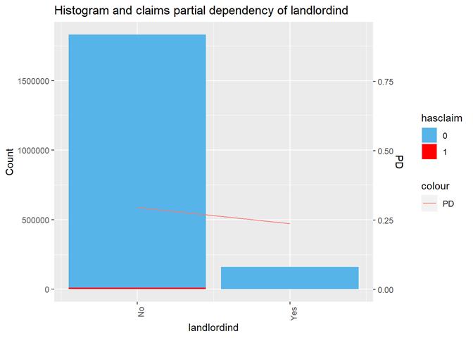
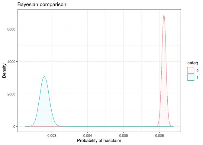
Landlordind
Yes(1)/No(0)
This is a discount based on the number of policies for the same
customer. It's correlated with customer_cnt_active_policies_binned
and has the same claim dependency but without details: more policies less
claims rate. It`s more easy to extract this attribute
plus it`s more precise.
Cross Plot

Histogram and claims partial dependency
Baysian comparison
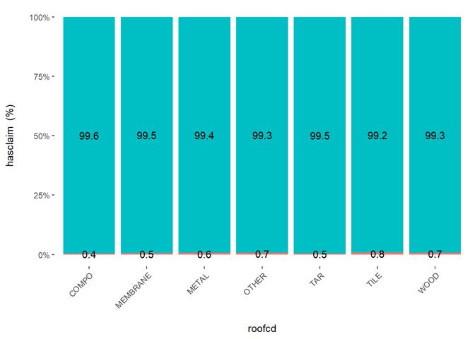
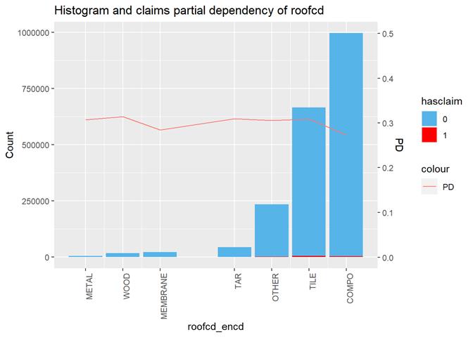
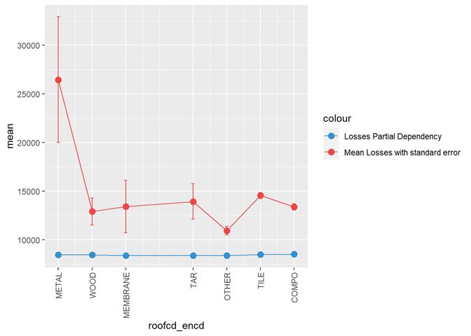
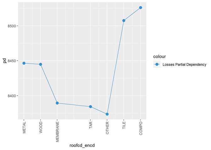
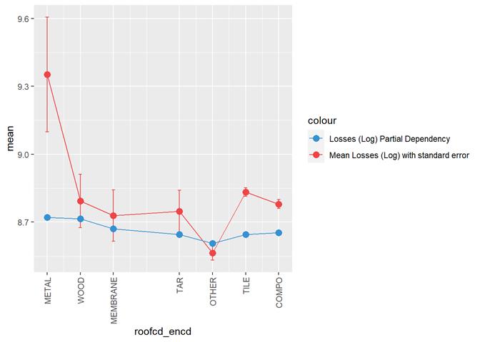
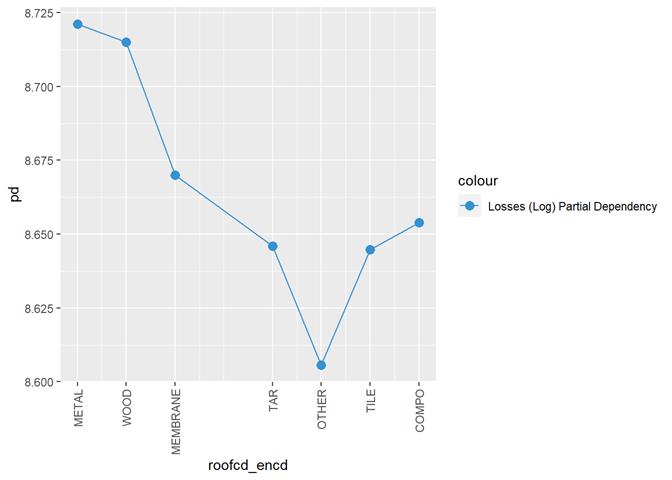
Roofcd
Visible higher claim rate in WOOD, TILE, and maybe, TAR and OTHER
|
COMPO |
8 |
|
|
TILE |
7 |
|
|
OTHER |
6 |
Any
other values, including empty (~) |
|
TAR |
5 |
|
|
ASPHALT |
4 |
|
|
MEMBRANE |
3 |
|
|
WOOD |
2 |
|
|
METAL |
1 |
|
Cross Plot
Histogram and claims partial dependency
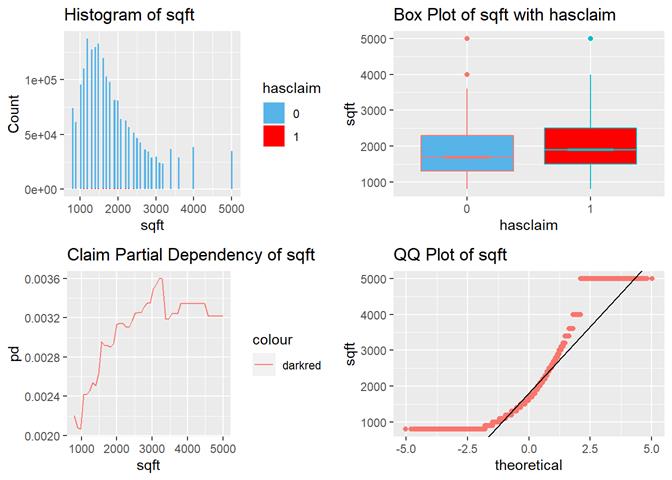
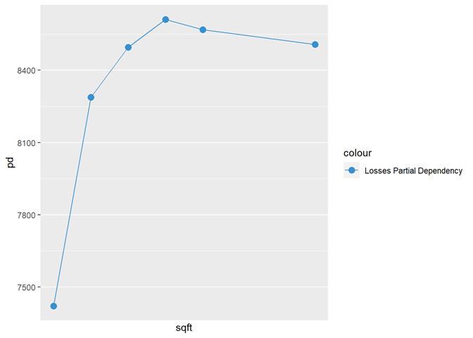
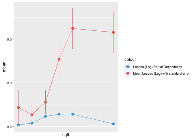
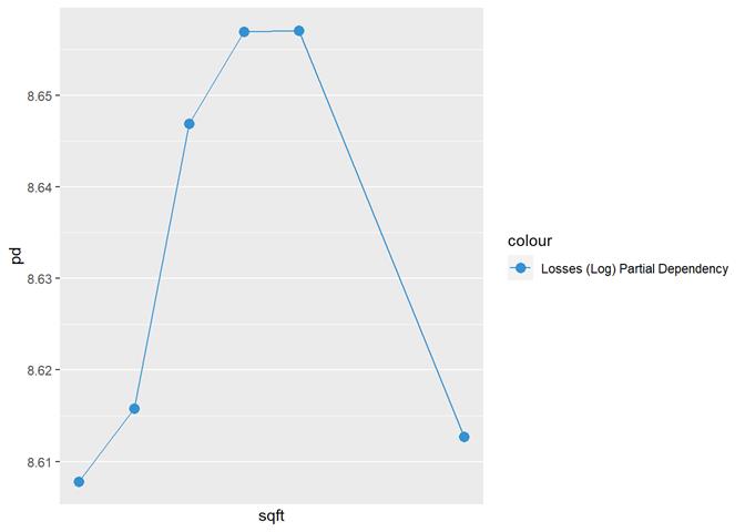
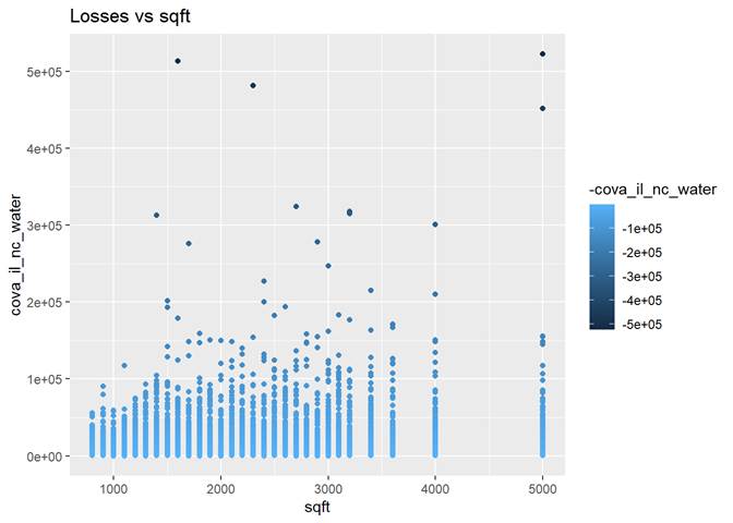
Sqft
The higher sqft, the higher claim rate
till some limit, where it is not increased.
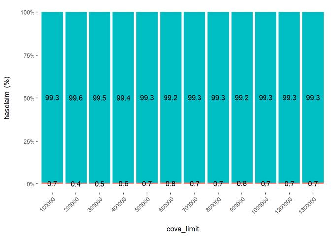
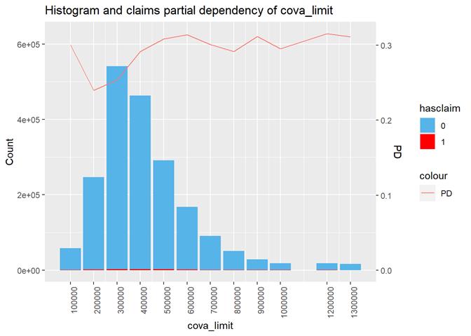
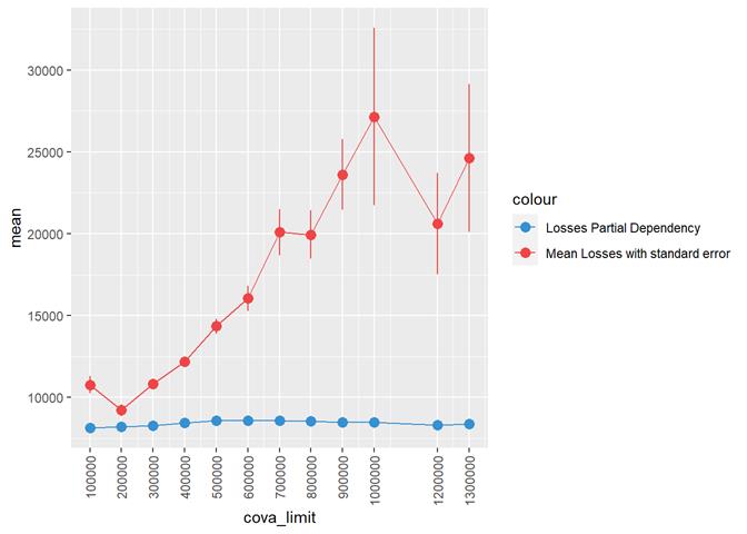
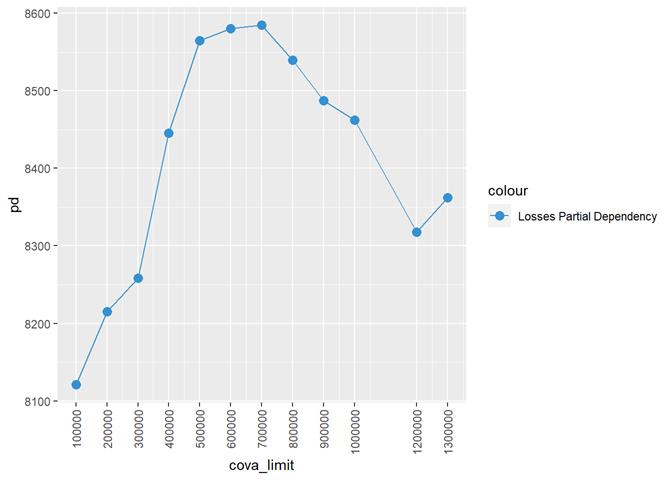
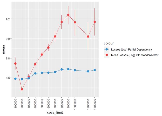
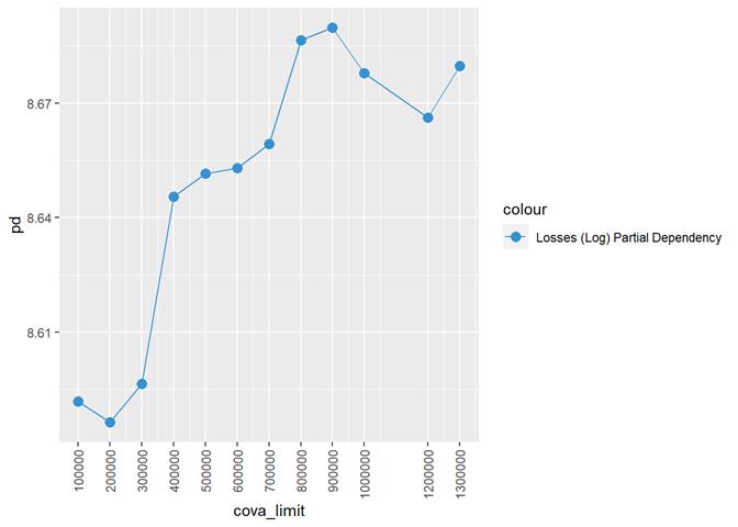
CovA Limit
More claims from more expensive properties.
Cross Plot
Histogram and claims partial dependency
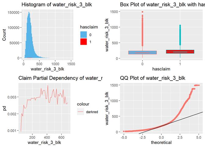
water_risk_3_blk
The higher the score, the more claims according to box-plots and
partial dependency.
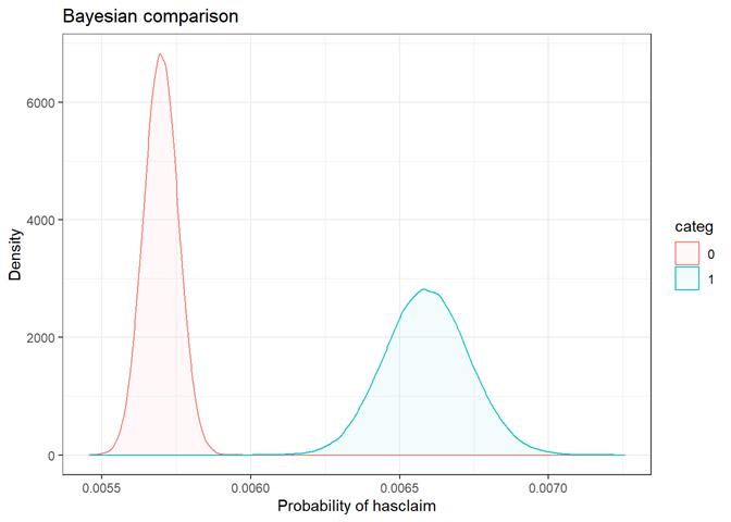
Multipolicyind
Yes(1)/No(0)
On the one hand, there are more claims in "Yes" multipolicyind category, on the other, it's
different in the partial dependency. The predictor is not very significant in
GLM. Added as an example not very significant feature for contrast.
Cross Plot
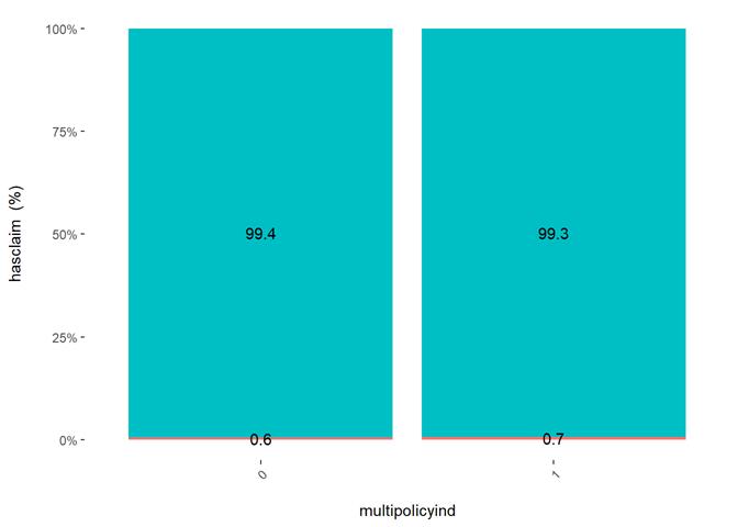
Histogram and claims partial dependency
Baysian comparison
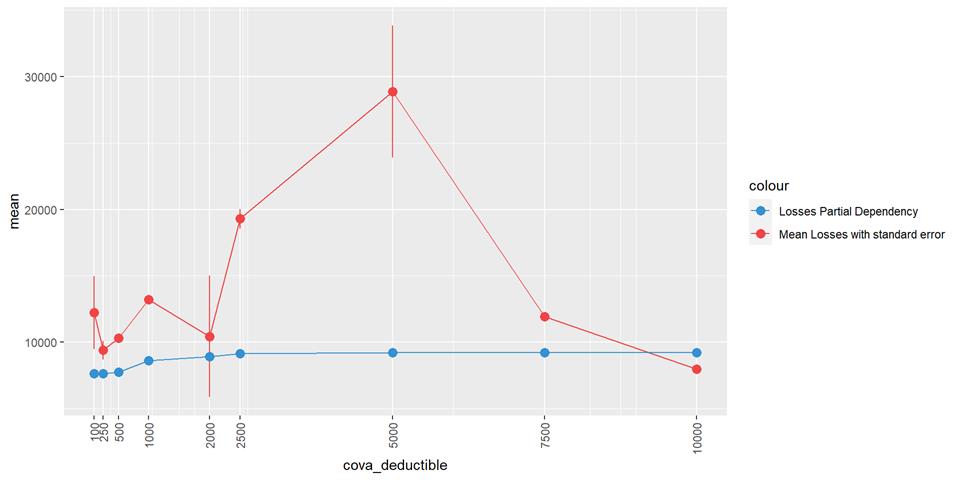
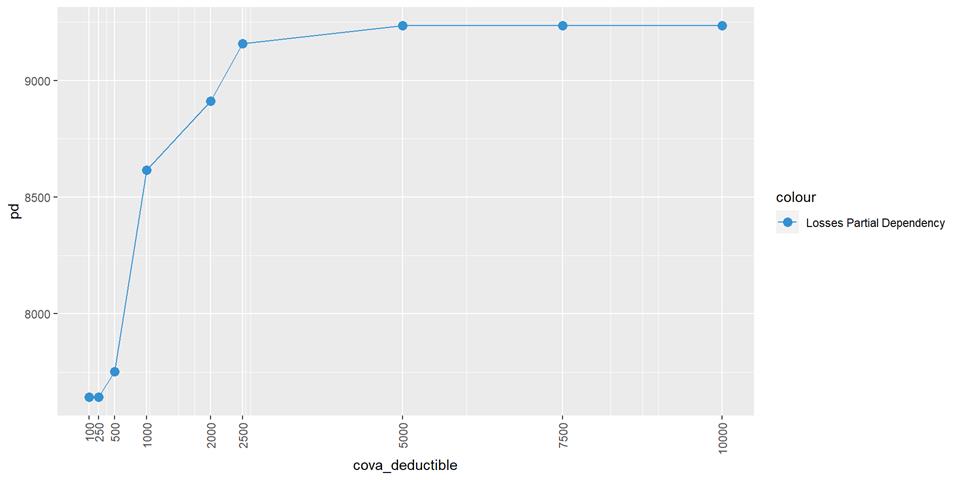
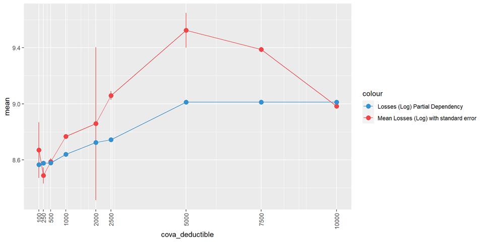
Severity
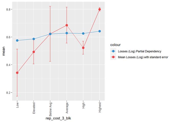
A popular method for comparing groups on a continuous variable is the mean plot with error bars. Error bars represents standard error in this section. The second plot is partial dependence plot from Gamma XGBoost regression or XGBoost regression (normal distribution for log of losses - cova_il_nc_water)
CovA Deductible
Losses mean plot with error bars
|
|
|
|
|
|
Roofcd
|
COMPO |
8 |
|
|
TILE |
7 |
|
|
OTHER |
6 |
Any
other values, including empty (~) |
|
TAR |
5 |
|
|
ASPHALT |
4 |
|
|
MEMBRANE |
3 |
|
|
WOOD |
2 |
|
|
METAL |
1 |
|
Losses mean plot with error bars
|
|
|
|
|
|
CovA Limit
Losses mean plot with error bars
|
|
|
|
|
|
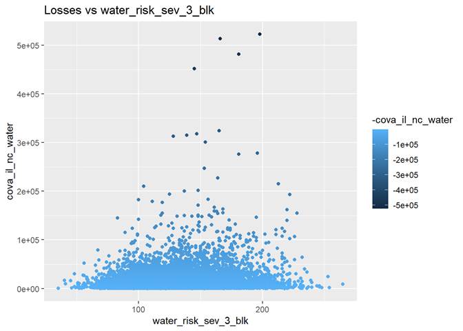
water_risk_sev_3_blk
The highest losses are between 100 and 200 water_risk_sev_3_blk.
We may have not enough data for higher numbers of water_risk_sev_3_blk
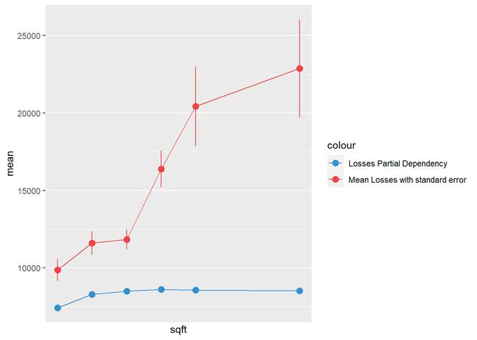
Sqft
|
|
|
|
|
|
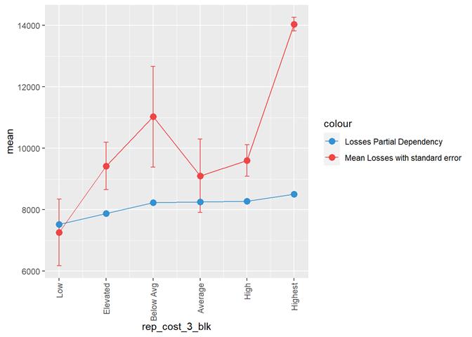
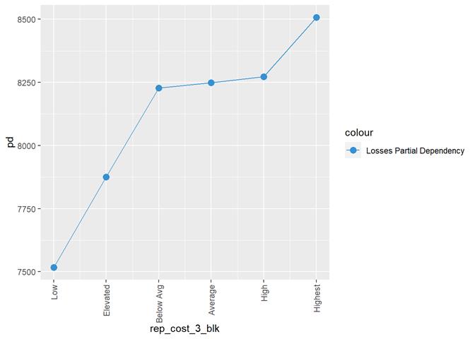
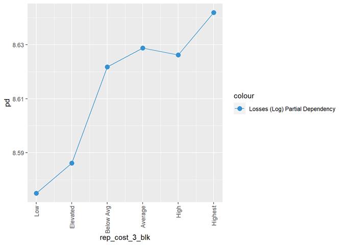
rep_cost_3_blk
Property
repair cost rating
The categorical scores were encoded to be used in some analysis methods:
|
Highest |
5 |
|
High |
4 |
|
Average |
3 |
|
Below Avg |
2 |
|
Elevated |
1 |
|
Low |
0 |
Losses mean plot with error bars
|
|
|
|
|
|
Yearbuilt
Ecy (exposure calendar year)