Water Peril Claims Research with XGBoost and GLM models
Contents
Dataset
and how the base data are created
Attributes
selected for further analysis
Generalized
Linear Models (GLM)
Generalized
Linear Models (GLM)
Models
explanation, comparing and exploring.
Feature
Importance and interactions
Individual
Observation Shap Value Plot
Portfolio
Analysis with Lorenz Curve
Models
exploring and comparing
Models
explanation and Tableau dashboards
Introduction
The original main purpose of the project is to build several machine learning models using different methods, compare results and estimate usability for analyzing risks.
Property modeling data were recently built and look like an easy (well, at least, smaller) dataset then Auto modeling data. Adding in the system LocationInc water risks scores narrowed the interest to water peril only.
Discovering the power of Shap Values and Lorenz curve added additional purposes to visualizing models results in Tableau dashboards.
Data
Dataset and how the base data are created
The data used in the project is a snapshot of property modeling data. All data are included in the base data extract since it will be separated into training and testing datasets later in the scripts. VPROPERTY_MODLEDATA view does not include most recent 3 months exposures and claims. That`s why the view was not used directly but instead the underlying script was adjusted for the project.
Properties with missing water scores are not included in the data and there are no scores for UT.
Some extreme values were also excluded from the project: yearbuilt less then 1850 and greater the 2020 as well as sqft less 600 and greater 10000.
Prediction: number of non-catastrophe water peril claim (cova_ic_nac_water) per calendar year exposure (ecy) or hasclaim (0/1 instead of a real number of claims) and incurred loss from non-catastrophe water peril claims (cova_il_nc_water) per calendar year exposure (ecy).
There are almost 50 predictors. Some of them were transformed for analysis. Only few were selected for the final models.
Continuous data grouping
There are few continuous variables were grouped to simplify analysis:
Yearbuilt
|
yearbuilt<=1900 |
1900 |
|
yearbuilt>1900
and yearbuilt<=1905 |
1905 |
|
yearbuilt>1905
and yearbuilt<=1910 |
1910 |
|
yearbuilt>1910
and yearbuilt<=1915 |
1915 |
|
yearbuilt>1915
and yearbuilt<=1920 |
1920 |
|
yearbuilt>1920
and yearbuilt<=1925 |
1925 |
|
yearbuilt>1925
and yearbuilt<=1930 |
1930 |
|
yearbuilt>1930
and yearbuilt<=1935 |
1935 |
|
yearbuilt>1935
and yearbuilt<=1940 |
1940 |
|
yearbuilt>1940
and yearbuilt<=1945 |
1945 |
|
yearbuilt>1945
and yearbuilt<=2007 |
Actual
yearbuilt |
|
yearbuilt>2007
and yearbuilt<=2009 |
2009 |
|
yearbuilt>2009
and yearbuilt<=2015 |
2015 |
|
else |
2019 |
Sqft (ceil is round up to the next whole number)
|
ceil(sqft
/ 100) * 100<=800 |
800 |
|
ceil(sqft
/ 100) * 100>800 and ceil(sqft / 100) * 100<=3200 |
ceil(sqft
/ 100) * 100 |
|
ceil(sqft
/ 100) * 100>3200 and ceil(sqft / 100) * 100<=3400 |
3400 |
|
ceil(sqft
/ 100) * 100>3400 and ceil(sqft / 100) * 100<=3600 |
3600 |
|
ceil(sqft
/ 100) * 100>3600 and ceil(sqft / 100) * 100<=4000 |
4000 |
|
ceil(sqft
/ 100) * 100>4000 |
5000 |
Stories is a broken attribute with a lot of issues. AS an example, there are yearbuilt sometimes in this attribute. A simple conversion was applied: if it`s 0 (empty) or greater then 3 then 1. Overall, I would not use this attribute in the analysis.
CovA (ceil is round up to the next whole number)
|
ceil(cova_limit
/ 100000) * 100000<=1000000 |
ceil(cova_limit
/ 100000) * 100000 |
|
ceil(cova_limit
/ 100000) * 100000>1000000 and ceil(cova_limit / 100000) *
100000<=1200000 |
1200000 |
|
else |
1300000 |
customer_cnt_active_policies
|
customer_cnt_active_policies=1
then 1 |
1 |
|
customer_cnt_active_policies>1
and customer_cnt_active_policies<=10 |
10 |
|
customer_cnt_active_policies>10
and customer_cnt_active_policies<=15 |
15 |
|
customer_cnt_active_policies>15
and customer_cnt_active_policies<=20 |
20 |
|
customer_cnt_active_policies>20
and customer_cnt_active_policies<=30 |
30 |
|
customer_cnt_active_policies>30
and customer_cnt_active_policies<=40 |
40 |
|
customer_cnt_active_policies>40
and customer_cnt_active_policies<=50 |
50 |
|
customer_cnt_active_policies>50
and customer_cnt_active_policies<=70 |
70 |
|
customer_cnt_active_policies>70
and customer_cnt_active_policies<=90 |
90 |
|
customer_cnt_active_policies>90
and customer_cnt_active_policies<=110 |
110 |
|
customer_cnt_active_policies>110
and customer_cnt_active_policies<=120 |
120 |
|
customer_cnt_active_policies>120
and customer_cnt_active_policies<=130 |
130 |
|
customer_cnt_active_policies>130 |
150 |
Categorical data encoding
Only numerical data can be used in XGBoost models. GLM models allow categorical predictors. That`s why all categorical data are converted to numbers according to these rules: if it`s an ordered attribute then the text value is replaced with a correspondent number, otherwise, the more observations have the same text value, the higher code.
RoofCd
|
COMPO |
8 |
|
|
TILE |
7 |
|
|
OTHER |
6 |
Any
other values, including empty (~) |
|
TAR |
5 |
|
|
ASPHALT |
4 |
|
|
MEMBRANE |
3 |
|
|
WOOD |
2 |
|
|
METAL |
1 |
|
UsagetypeCd
|
PRIMARY |
7 |
|
|
RENTAL |
6 |
|
|
COC |
5 |
|
|
VACANT |
4 |
|
|
SEASONAL |
3 |
|
|
SECONDARY |
2 |
CovADDRR_SecondaryResidence
is included if Yes |
|
UNOCCUPIED |
1 |
|
ConstructionCd
|
F |
5 |
|
|
AF |
4 |
|
|
B |
3 |
|
|
OTHER |
2 |
Includes
all other codes not in the table |
|
M |
1 |
|
Water Scores
|
Highest |
5 |
|
High |
4 |
|
Average |
3 |
|
Below Avg |
2 |
|
Elevated |
1 |
|
Low |
0 |
Occupancycd
|
OCCUPIEDNOW |
1 |
Combines all values started from OCCUPIED |
|
TENANT |
2 |
|
Sprinklersystem was converted to Yes/No first.
The rest of the categorical fields are simple Yes/No flags. None and empty (~) values were converted into No.
|
Yes |
1 |
|
No |
0 |
Reportedfirehazardscore and firehazardscore were converted into a numerical attribute with a complex logic.
|
Reportedfirehazardscore |
firehazardscore |
Fire_Risk_Model_Score |
|
Extreme |
|
6 |
|
High |
|
4 |
|
Moderate |
|
2 |
|
Low |
|
1 |
|
Negligible |
|
0 |
|
Indeterminate or empty |
|
|
|
|
Extreme |
6 |
|
|
High |
4 |
|
|
Moderate |
2 |
|
|
Low |
1 |
|
|
Negligible |
0 |
I do not think it`s important for water related claims. For fire claims a valid score should be added in the property modeling data first.
XGBoost models do not require one-hot encoding and the models operates with the above codes instead of text attributes.
Exploratory Data Analysis
Visual representation
R and Python code and output:
-
EDA.0.
Classification - Preparing Dataset for Frequency Feature Importance
-
EDA.1.
Feature Importance from XGB Classification
-
EDA.2.
Severity - Preparing Dataset for Gamma Distribution Feature Importance
-
EDA.3.
Severity - Feature Importance from XGB Gamma Distribution
-
EDA.4.
Severity - Preparing Dataset for Normal Distribution Feature Importance
-
EDA.5.
Severity - Feature Importance from XGB Regression
-
EDA.7
Frequency - Visualization_Final
- EDA.8 Severity - Visualization
With number of predictors close to 50 there should be a smart way to analyze them and select more important.
- Most Important Attributes Exploratory Data Analysis
- Water Scores Exploratory Data Analysis
Since there are very few exposures with more then 1 claim, in this stage of analysis I use hasclaim (0/1 or No/Yes) attribute as the target instead of the real number of claims per exposure.
Ensembles of decision tree methods like XGBoost can automatically provide estimates of feature importance from a trained predictive model. So, first, I ran XGBoost classification using the full dataset as training. I am not interested in the prediction itself at this stage but rather feature importance and partial dependencies. The partial dependence plots show the marginal effect a feature has on the predicted outcome of a model.
Previously I tried an other methods like Boruta feature importance, but with the very low rate of positive values (claims) no one feature is significant enough. (It may also related to the fact XGBoost can not be used inside the method and other decision tree methods not powerful enough.)
At this point I have an approximate order of features based on their importance.
The second complication is the large amount of categorical predictors we need to validate versus categorical (hasclaim) or discrete (cova_ic_nac_water, number of claims) dependent variables. And here in hands come a very interesting R package - funModeling with a number of functionality specifically for categorical attributes.
The cross_plot shows how the input variable is correlated
with the target variable, getting the likelihood rates for each input's
bin/bucket
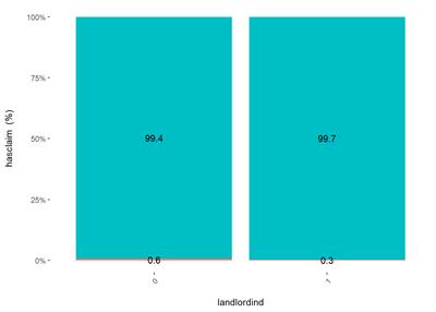
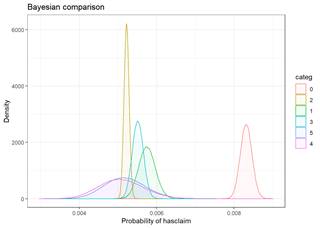
The bayesian_plot shows how the input variable is correlated with the target variable, comparing with a bayesian approach the posterior conversion rate to the target variable. It`s useful to compare categorical values, which have no intrinsic ordering (not ordered).
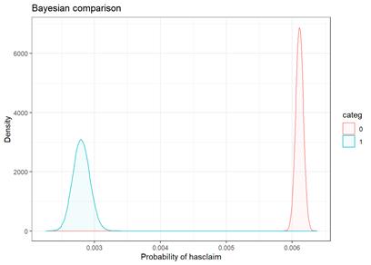
For landlordind attribute, both plots show the category 0 (No) has hire rate of claims then category 1 (Yes)
Unfortunately, bayesian_plot does not work with the number of groups higher then 5.
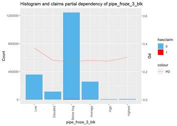
The third type of plots I used is the combination a bar-plot with the number of observations in each group, filled with the number of observations with claims and partial dependency plot from XGBoost classification.
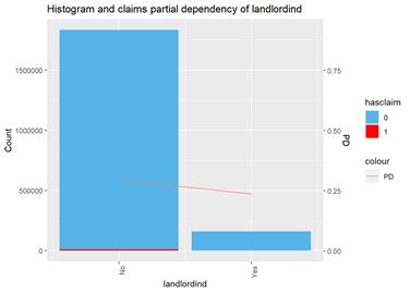
This plot highlights the skew to ``No`` group with more claims and tendency to less claims in ``Yes`` group from XGBoost classification partial dependency.
For continuous attribute the most informative is a box-plot and partial dependency plot. The other plots are used to check if the distribution is close to the normal.
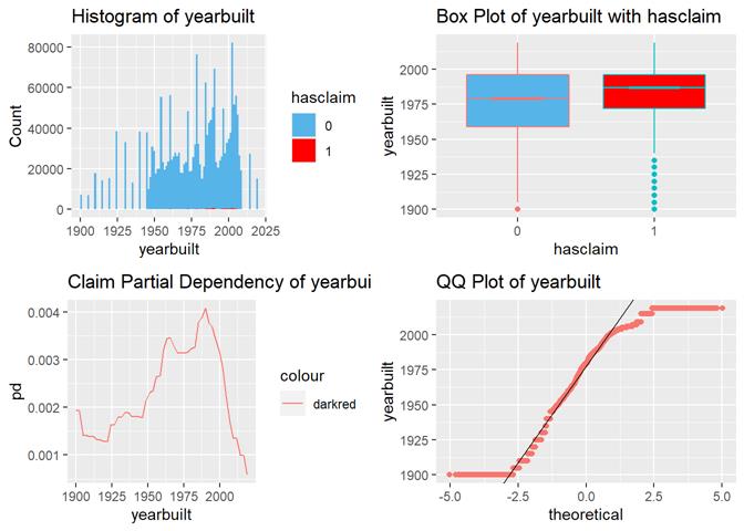
Yearbuilt box-plot shows there are more claims in more modern properties but not in the most recent.
Severity is a continuous attribute and there are different types of plots were used to analyze if there are any dependencies
A popular method for comparing groups on a continuous variable is the mean plot with error bars. Error bars represents standard error in this section. The second plot is partial dependence plot from Gamma XGBoost regression or XGBoost regression (normal distribution for log of losses - cova_il_nc_water)
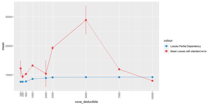
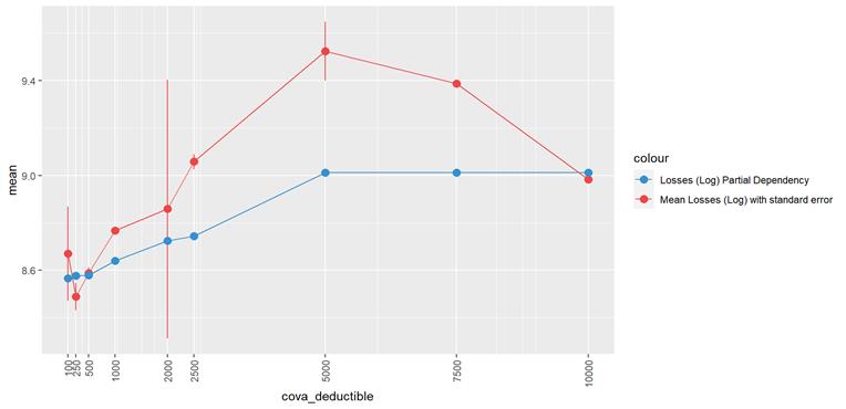
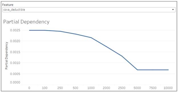
In the case of CovA-Deductible, the mean plot and the partial dependency plot shows the higher the deductible, the higher the losses.
To review dependencies between continuous target variable and continuous predictors points plot is used.
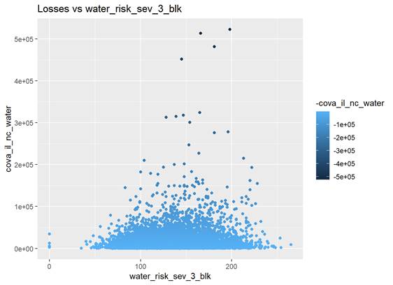
There are more higher losses with water_risk_sev_3_blk values around 150
Correlation
R code and output:
There is no
correlation observed between predictors and response variable. However,
correlation between predictors can explain why visually we can see some not
expecting dependency between some predictors and response variables.
Also strong correlated
predictors should not be used together in some models.
As mentioned above,
there are a lot of categorical attributes. There is no straightforward way to
measure correlation between categorical and continuous or between categorical
and categorical features.
R GoodmanKruskal
package, somewhat experimental approach, converts numerical variables into
categorical ones, which may then be used as a basis for association analysis
between mixed variable types.
Widely used Pearson
and Spearman methods work only with continuous attributes. I used encoded
(_encd) features in these methods.
The other challenge is
to work with 50 attributes on the same time. Even if it`s possible to
calculate, the review of a huge correlation matrix is not fun. I work with
subset of predictors
Important correlations to take into account:
- CovA Limit and sqft
- CovA Limit and CovA Deductible
- yearbuilt and sqft
- LandLordInd discount and related number of other policies for the same customer (customer_cnt_active_policies_binned)
- LandLordInd and PropertyManager
- LandLordInd and OrdinanceOrLawpct
- OrdinanceOrLawpct and SafeguardPlusind
- LandLordInd and Replacementcostdwellingind
- firealarmtype and burglaryalarmtype. Is this one device?
- kitchenfireextinguisherind and deadboltind (looks like some products require the data and they are just provided together)
- Strong correlation between: water_risk_3_blk and water_risk_fre_3_blk
- Negative correlation between: water_risk_fre_3_blk and water_risk_sev_3_blk
Distribution
R code and output:
Frequency, number of events (claims) for some period of time (exposure), is close to Poisson or Negative Binomial discrete distribution.
Severity can be described as Gamma distribution or log of Severity is more close to Normal distribution.
Attributes selected for further analysis
XGBoost experiments setup and results:
Based on the visual analysis, correlation, and numerous experiments (running XGBoost and GLM models) with different set of features these attributes were selected for modeling:
Frequency:
|
# |
Predictor |
Comment |
|
1 |
usagetype |
The
more property is used, the higher claims rate. |
|
2 |
ecy |
The
longer the exposure, the higher claim rate. |
|
3 |
cova_deductible |
The
claim rate is higher in low deductible policies. |
|
4 |
Yearbuilt
or PropertyAge= Calendar Year - Yearbuilt |
There
is non linear dependency with a peak at 20 – 30 years old properties. Yearbuilt
has more predictive power but it might be the same (predictive power) in a
different dataset. PropertyAge is a more general attribute. |
|
5 |
Landlordind
or customer_cnt_active_policies |
LandLordInd is a discount in Dwelling line of business only and it’s based on the number of policies for the same customer. It's correlated with customer_cnt_active_policies and has the same claim dependency but without details: more policies less claims rate. It`s more easy to extract LandLordInd then calculate count of active policies for the same customer and it`s more precise. However, customer_cnt_active_policies has more predictive power. Nevertheless, importance of this attribute in the current dataset can be explain by the mix of 2 line of business: Homeowners and Dwelling. The attribute is always 0 in Homeowners policies and Dwelling policies has less claims. The models simple distinguish Homeowners from Dwelling. In Dwelling dataset alone the attributes are not so powerful. |
|
6 |
sqft |
The
higher sqft, the higher claim rate till some limit, where it is not
increased. |
|
7 |
water_risk_3_blk |
The
higher the score, the more claims according to box-plots and partial dependency. |
Severity:
|
# |
Feature |
Comment |
|
1 |
cova_deductible |
|
|
2 |
roofcd_encd |
|
|
3 |
cova_limit |
|
|
4 |
water_risk_sev_3_blk |
The
highest losses are between 100 and 200 water_risk_sev_3_blk. We may have not
enough data for higher numbers of water_risk_sev_3_blk |
|
5 |
sqft |
|
|
6 |
rep_cost_3_blk |
|
|
7 |
yearbuilt |
|
|
8 |
ecy |
|
In the experiments, the models were trained and validated in CV based on training dataset (all data till 2019 calendar year) and the decision was made based on the testing dataset (2019 calendar year) model score.
First, a base set of feature was defined: YearBuilt, CovA Deductible and Sqft. A BaseModel was trained. Then all other features were added one by one to the base set and the result of each such model compared to the BaseModel. See BaseFeatures experiment in Set1-Classification.xlsb.
Then plots of partial dependencies for best features were built (BaseFeaturesPD experiment) and numerous models based on different combinations of features were built and compared along with hyperparameters tuning.
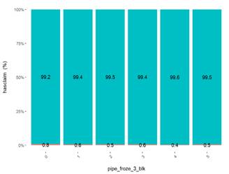
The other criteria adding an attribute in the list is common sense. Pipe_froze_3_blk is very significant in XGBoost and GLM and visible one category is far away from other categories for the claim rate. However, all 3 methods show the same: the highest water claim rate is in ``Low`` group. Well, for California having most of water claims with a low pipe froze probability maybe makes sense, but not for the model.
One more category of attributes is ``broken``. They may show a significant impact but knowing the way how they are populated in the database I would not add them to the final model just because they are not reliable. The example is Stories. There are plenty of empty values or total numbers of stories in a building or even a yearbuilt in some cases.
I did not investigate impact of interactions. Significant combinations of the attributes were found but no experiments adding them in the models.
Training and Testing data
The original modeling data entries (calendar year exposures) were separated based on the calendar year. So, if there is one-year policy without mid-term changes, effective in July 2018 and expiring in July 2019, half of the policy is in 2018 calendar year and half in 2019.
Data till 2019 calendar year were used as training and validation data and 2019 calendar year is testing data.
Even without calendar year separation the same policy but different terms can be present in both training and testing data. This is a feature of insurance data and it impacts the model scores.
Some sources suggest to add a policy term number to the attributes to make the data more random but I did not explore this technic. The other option is to add a correction coefficient based on the number of policy terms present in both, training and testing sets.
Models
Frequency
Frequency target variable is the number of claims per unit of exposure. Mathematically, this is equivalent to adding an offset term. An offset is formally defined as a predictor whose coefficient is constrained to be 1.
There is a special offset parameter in classical GLM models which is set as log(exposure)
There is no offset parameter in XGBoost but instead base margin is used in a similar way.
Generalized Linear Models (GLM)
R code:
-
Final.1.1.
Frequency - Poisson GLM ecy as offset
-
Final.1.2.
Frequency - Poisson GLM ecy as a feature
-
Final.2.1.
Frequency - NB GLM ecy as offset
-
Final.2.2.
Frequency - NB GLM ecy as a feature
The basic count data regression models are be represented with GLM framework known since the early 1970. GLM describes the dependence of a scalar variable on a vector of regressors. The conditional distribution is a linear exponential family with probability density function. The function can be normal, binomial or Poisson.
It`s a classical method used to model ratings based on coefficients produced by the models.
Target variable is cova_ic_nc_water (number of claims)
- Numerical attributes were converted using natural logarithm for these types of models.
|
# |
Model |
Comment |
|
1 |
Poisson GLM (feature) |
Classical GLM estimated by maximum likelihood. Log_ecy is used as a feature instead of offset |
|
2 |
Poisson GLM (offset) |
|
|
3 |
Negative Binomial GLM (feature) |
Extended GLM estimated by maximum likelihood. With an additional shape parameter. Log_ecy is used as a feature instead of offset |
|
4 |
Negative Binomial GLM (offset) |
|
Gradient boosting (XGBoost)
Python code:
06. AWS Sagemaker XGBoost Partial Dependency.ipynb
09.AWS Hyperparameter Tuning job for XGBoost Classification.ipynb
The same code is used for all XGBoost model types. It trains several models to compare results based on the configured list of features and/or parameters. XGBoost CV function is used to perform cross validation. The idea is to do a deep model comparison with the same method (XGBoost Logistic or Poisson regression), target variable and dataset but different sets of features and/or parameters.The output is not just a model and score but also feature importance, test dataset evaluation score and training/validation errors to analyze overfitting.
XGBoost trains many sequential models to minimize the residual error of the sum of previous model. Each model is a decision tree, or more specifically a classification and regression tree. Training a decision tree determines series of rule-based splits on the input to classify output. The algorithm generalizes this to regression by taking continuously valued weights on each of the leaves of the decision tree.
|
# |
Model |
Type |
Comment |
Target |
|
1 |
BaseModel0 |
Logistic regression* |
Binary classification, returns predicted probability scores***. Exploring what is the impact of core property attributes assuming all policies have the same exposure,and Deductible. Ecy and CovA_Deductible are not included in the model. |
HasClaim (0/1) |
|
2 |
BaseModel1 |
Logistic regression |
Binary classification, returns predicted probability scores. Exploring impact of different CovA Deductible but still assuming the same exposure for all policies. CovA_Deductible is added into BaseModel0 but not ecy. |
HasClaim (0/1) |
|
3 |
Classification XGB (feature) |
Logistic regression |
Binary classification, returns predicted probability scores. All features mentioned above are included. Ecy is used as a feature. |
HasClaim (0/1) |
|
4 |
Poisson XGB (feature) |
Poisson regression |
Poisson regression for count data, output mean of poisson distribution**. All features mentioned above are included. Ecy is used as a feature. |
cova_ic_nc_water (number of claims)
|
|
6 |
Poisson XGB (base margin) |
Poisson regression |
This is the most similar approach to classical GLM models. |
cova_ic_nc_water (number of claims)
|
* Logistic regression models use custom gini
function as objective.
**One could expect output from Poisson regression like an
integer value or, at least, greater then 0, which is the number of claims per
exposure. Instead the means of Poisson distribution from the model are very
small decimal values. This is the result of very small percent of claims in the
data. If I apply a special technics to reduce number of zero claims in the
training data set, the output is close to 1.
***Classification models returns probability like scores
but not a real probabilities. A special correction procedure – calibration –
can by applied to the model results to convert probability like scores into
probability. It was not done in the project.
Combination of all models
Python code:
-
Final.4.1
Frequency - All Models ecy as base margin - Poisson XGBoost
- Final.4.2 Frequency - All Models ecy as a feature - Poisson XGBoost
Different methods may learn different characteristics of the data, make different types of errors, or generalize differently. Ensemble methods combine different algorithms. I implemented stacking, when the outputs of several models are taken as the input set for a new XGBoost model. The output of this `second level` XGBoost is the predictions of the ensemble.
The result is not better then the individual models result. I observe severe overfitting. It does not mean the ensemble method does not work. I may do something wrong.
Other
R Code:
-
R
Frequency Hurdle - Poisson
-
R
Frequency Zero Inflated - NB
-
R
Frequency Zero Inflated - Poisson
- Python UnderSampling-Testing Different Methods
The other models were tried but not included in the final due to low output score or instability: Zero Inflated, Hurdle.
Zero Inflated and Hurdle models are applied for datasets where more zero observations than would be allowed for by the Poisson or negative Binomial models.
They are two-component mixture models combining a point mass at zero with a count distribution such as Poisson or negative binomial. Thus, there are two sources of zeros: zeros may come from both the point mass and from the count component. For modeling the unobserved state (zero vs. count), a binary model is used: in the simplest case only with an intercept but potentially containing regressors.
Looks like the models perform well with small datasets (200 observations with 20-30 positive only) and low number of predictors. Such datasets are common in social studies or biological research.
The models just choked on the number of predictors, run slow and produce low score.
Severity
Generalized Linear Models (GLM)
R Code:
Attributes used in GLM model (excluding correlated and log conversion of numerical):
- Ecy
- cova_deductible
- log_yearbuilt
- log_sqft
- log_water_risk_sev_3_blk
- rep_cost_3_blk
- usagetype_encd
|
# |
Model |
Type |
Comment |
Target |
|
|
Gamma GLM Regression |
GLM Gamma |
|
cova_il_nc_water (incurred losses) |
Gradient boosting (XGBoost)
Python code:
-
Final.1
Severity - XGBoost Linear Regression mae
-
Final.2
Severity - XGBoost LogRegObj Regression mae
- Final.3 Severity - XGBoost Gamma Regression
|
# |
Model |
Type |
Comment |
Target |
|
1 |
Gamma XGB Regression |
Gamma regression |
Output is a mean of gamma distribution |
cova_il_nc_water (incurred losses) |
|
2 |
Linear XGB Regression |
Linear regression |
Default objective (sum of squared error) |
Log_cova_il_nc_water (log of incurred losses for normal distribution) |
|
3 |
Custom Linear XGB Regression |
Linear regression |
Custom objective |
Log_cova_il_nc_water (log of incurred losses for normal distribution) |
Models evaluation and scoring
It`s more or less straightforward to measure accuracy of the continuous variables prediction like severity. MAE and RMSE are commonly used metrics.
Similarities: Both MAE and RMSE express average model prediction error in units of the variable of interest. Both metrics can range from 0 to ∞ and are indifferent to the direction of errors. They are negatively-oriented scores, which means lower values are better.
Differences: Taking the square root of the average squared errors has some interesting implications for RMSE. Since the errors are squared before they are averaged, the RMSE gives a relatively high weight to large errors. This means the RMSE should be more useful when large errors are particularly undesirable.
This simple approach does not work for the discrete variables like frequency, especially when there are only 0.5% of positive results.
Traditionally GLM models are compared based on LogLikelihood, AIC, BIC, e.g. how good the model fits Poisson distribution. However, this approach works only for nested models. In a simply words we relatively easily can compare models based on the same distribution, method and data set but with different set of predictors. Some sources suggest Vuong test to compare not nested models but there are the same number of sources which strongly do not recommend Vuong test for the purpose.
Classification metrics like accuracy or precision do not work either because they consider 0 is the best prediction with low level of positive results. Instead ROC-AUC and Gini coefficients are used to score classification models.
The Gini coefficient measures the inequality among values of a frequency distribution (originally, levels of income). A Gini coefficient of zero expresses perfect equality, where all values are the same (for example, where everyone has the same income). A Gini coefficient of one (or 100%) expresses maximal inequality among values (e.g., for a large number of people where only one person has all the income or consumption and all others have none, the Gini coefficient will be nearly one).
Normalized Weighted Gini score was used in Kaggle Liberty Mutual Group - Fire Peril Loss Cost Predict expected fire losses for insurance policies competition.
There are several pre-built packages exist in R to calculate weighted Gini. I used the code suggested in the competition sine, it`s almost the same what I am doing in the project.
There are discussions the score is not perfect since it depends on ordering of observations and the number of the observation, but this is the best what I found.
R and Python code:
The better models have higher Gini or Weighted Gini scores.
I used 10-folds cross-validation (CV) to score the models. The training data (2009 - 2018) were randomly segmented into 10 equal partitions. The models were trained and validated on 10 partitions and tested on 2019 data.
Frequency
Custom Gini function was used in XGBoost classification models to estimate the individual models in ensembles. LogLikelihood in Poisson and Negative Binomial Regression models.
Normalized Weighted Gini was used in the project to estimate accuracy of final frequency models. The weight is exposure.
|
Model |
BaseModel0 |
BaseModel1 |
Classification XGB (feature) |
|
F1 |
cal_year-yearbuilt |
cal_year-yearbuilt |
cal_year-yearbuilt |
|
F2 |
cova_deductible |
cova_deductible |
|
|
F3 |
sqft |
sqft |
sqft |
|
F4 |
customer_cnt_active_policies |
customer_cnt_active_policies |
customer_cnt_active_policies |
|
F5 |
usagetype_encd |
usagetype_encd |
usagetype_encd |
|
F6 |
water_risk_3_blk |
water_risk_3_blk |
water_risk_3_blk |
|
F7 |
|
|
ecy |
|
objective |
binary:logistic |
binary:logistic |
binary:logistic |
|
eval_metric |
auc |
auc |
auc |
|
booster |
gbtree |
gbtree |
gbtree |
|
scale_pos_weight |
0.3 |
0.3 |
0.3 |
|
colsample_bylevel |
0.8 |
0.8 |
0.8 |
|
colsample_bytree |
0.8 |
0.8 |
0.8 |
|
eta |
0.069459603 |
0.069459603 |
0.069459603 |
|
subsample |
0.300709377 |
0.300709377 |
0.300709377 |
|
max_depth |
4 |
4 |
4 |
|
reg_lambda |
1 |
1 |
1 |
|
reg_alpha |
0 |
0.514598589 |
0.514598589 |
|
test-gini-2019 |
0.343113828 |
0.375157665 |
0.480673242 |
|
test-std-2019 |
0.002264083 |
0.002305145 |
0.002275521 |
|
test-sem-2019 |
0.000715966 |
0.000728951 |
0.000719583 |
|
train-gini-mean |
0.3464572 |
0.3631359 |
0.4782352 |
|
valid-gini-mean |
0.3353052 |
0.3525957 |
0.4676617 |
|
Overfitting |
3.22% |
2.90% |
2.21% |
|
train-gini-std |
0.001322371 |
0.002257472 |
0.002114688 |
|
train-gini-sem |
0.000418171 |
0.000713875 |
0.000668723 |
|
valid-gini-std |
0.010041193 |
0.014255945 |
0.014867501 |
|
valid-gini-sem |
0.003175304 |
0.004508126 |
0.004701517 |
XGBoost Logistic Regression Models (Classification)
|
Model |
BaseModel |
Log |
Offset |
Offsetlog |
|
F1 |
cal_year-yearbuilt |
cal_year-yearbuilt |
cal_year-yearbuilt |
cal_year-yearbuilt |
|
F2 |
cova_deductible |
cova_deductible |
cova_deductible |
cova_deductible |
|
F3 |
sqft |
sqft |
sqft |
sqft |
|
F4 |
customer_cnt_active_policies |
customer_cnt_active_policies |
customer_cnt_active_policies |
customer_cnt_active_policies |
|
F5 |
usagetype_encd |
usagetype_encd |
usagetype_encd |
usagetype_encd |
|
F6 |
water_risk_3_blk |
water_risk_3_blk |
water_risk_3_blk |
water_risk_3_blk |
|
F7 |
ecy |
log_ecy |
N/A |
N/A |
|
Offset |
N/A |
|
ecy |
log_ecy |
|
objective |
count:poisson |
count:poisson |
count:poisson |
count:poisson |
|
eval_metric |
poisson-nloglik |
poisson-nloglik |
poisson-nloglik |
poisson-nloglik |
|
booster |
gbtree |
gbtree |
gbtree |
gbtree |
|
colsample_bylevel |
0.8 |
0.8 |
0.8 |
0.8 |
|
colsample_bytree |
0.8 |
0.8 |
0.8 |
0.8 |
|
eta |
0.01 |
0.01 |
0.01 |
0.01 |
|
subsample |
0.8 |
0.8 |
0.8 |
0.8 |
|
max_depth |
6 |
6 |
6 |
6 |
|
test-poisson-nloglik-2019 |
0.037700113 |
0.037700062 |
0.038113331 |
0.037682727 |
|
test-std-2019 |
1.23065E-05 |
1.23344E-05 |
9.65389E-06 |
1.2607E-05 |
|
test-sem-2019 |
3.89166E-06 |
3.90049E-06 |
3.05283E-06 |
3.9867E-06 |
|
train-poisson-nloglik-mean |
0.0356623 |
0.0356623 |
0.0362245 |
0.0358495 |
|
valid-poisson-nloglik-mean |
0.0364295 |
0.0364296 |
0.0367877 |
0.0364125 |
|
Overfitting |
-2.15% |
-2.15% |
-1.55% |
-1.57% |
|
train-poisson-nloglik-std |
2.19E-05 |
2.19E-05 |
2.00E-05 |
2.27E-05 |
|
train-poisson-nloglik-sem |
6.93E-06 |
6.93E-06 |
6.31E-06 |
7.18E-06 |
|
valid-poisson-nloglik-std |
1.77E-04 |
1.77E-04 |
1.62E-04 |
1.80E-04 |
|
valid-poisson-nloglik-sem |
5.60E-05 |
5.61E-05 |
5.11E-05 |
5.70E-05 |
XGBoost Poisson Regression models
|
(training) |
Poisson GLM ecy as a feature |
Poisson GLM ecy as offset |
NB GLM ecy as a feature |
NB GLM ecy as offset |
|
AIC
mean |
92,303.3640 |
92,303.8960 |
92,044.2020 |
92,044.7720 |
|
AIC
sem |
36.9933 |
37.5203 |
35.5646 |
36.0891 |
|
AIC
std |
82.7195 |
83.8980 |
79.5249 |
80.6976 |
|
BIC
mean |
92,460.3000 |
92,448.7600 |
92,213.2100 |
92,201.7060 |
|
BIC
sem |
36.9938 |
37.5191 |
35.5647 |
36.0879 |
|
BIC
std |
82.7208 |
83.8953 |
79.5251 |
80.6951 |
|
logLik
mean* |
-46,138.6820 |
-46,139.9480 |
-46,008.1020 |
-46,009.3860 |
|
logLik
sem |
18.4968 |
18.7602 |
17.7832 |
18.0430 |
|
logLik
std |
41.3601 |
41.9490 |
39.7644 |
40.3454 |
*LogLik is calculated different in XGBoost and GLM models
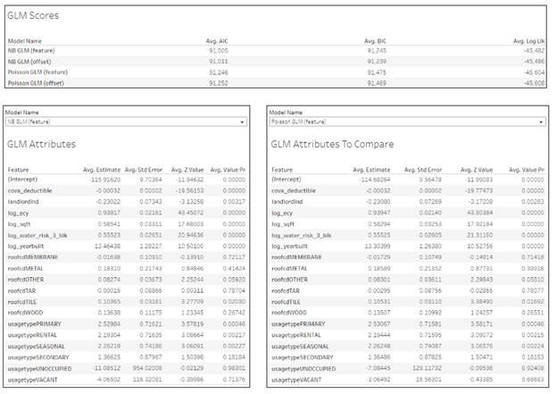
GLM Poisson and Negative Binomial models
|
Model |
test Normalized Weighted Gini mean 2019 |
test Normalized Weighted Gini std 2019 |
test Normalized Weighted Gini sem 2019 |
|
Classification
with ecy |
0.414481 |
0.002782 |
0.00088 |
|
Poisson
ecy as a feature |
0.440293 |
0.001221 |
0.000386 |
|
Poisson
Log ecy as a feature |
0.440296 |
0.001222 |
0.000387 |
|
Poisson
ecy as an offset(base margin) |
0.431306 |
0.001148 |
0.000363 |
|
Poisson
Log ecy as an offset(base margin) |
0.440907 |
0.001282 |
0.000406 |
|
Poisson
GLM ecy as a feature |
0.40889636 |
0.000161443 |
0.000360998 |
|
Poisson
GLM ecy as offset |
0.40866034 |
0.000188845 |
0.000422269 |
|
NB
GLM ecy as a feature |
0.40888586 |
0.000161161 |
0.000360367 |
|
NB
GLM ecy as offset |
0.40864958 |
0.000188842 |
0.000422263 |
Table Comparing XGBoost Classification (with ecy), Poisson Regression and GLM Models
The models in each family show similar power. It`s significantly higher in XGBoost models, and in this family, Poisson Regression with log ecy as offset has the maximum Weighted Gini..
GLM family models have identical scores. The difference is in 4th number after the comma. They are so identical I triple check I did not make mistake in the functions.
Training score is less then testing which is not expected. I think it`s because the score depends on the number of observations and number of claims is higher in the latest year and early earls with less claims are taken into account in the training data. The score of 2018 calendar year alone (which is a part of training data) is 0.428 and this what I expect for training data (higher then testing).
Severity
MAE was used to estimate individual models in XGBoost ensembles.
Normalized Weighted Gini was used as a final model score. The weight is count of claims.
|
Model |
Training Normalized
Weighted Gini |
Training MAE |
Training RMSE |
Testing Normalized
Weighted Gini |
Testing MAE |
Testing RMSE |
|
Linear XGB
Regression |
0.282 |
9,716.157 |
22,302.217 |
0.296 |
11,244.632 |
22,211.114 |
|
Custom Linear
XGB Regression |
0.298 |
9,674.240 |
22,346.456 |
0.285 |
11,245.017 |
22,120.953 |
|
Gamma XGB
Regression |
0.291 |
6,784.743 |
9,514.663 |
0.221 |
11,294.062 |
21,936.495 |
|
Gamma GLM
Regression |
0.291 |
7,471.694 |
9,716.652 |
0.280 |
11,551.695 |
21,480.446 |
Table Severity models
The results of all methods are consistently bad. They are close to an average loss per all observations.
Gini Index and Lorenz Curve
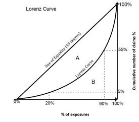
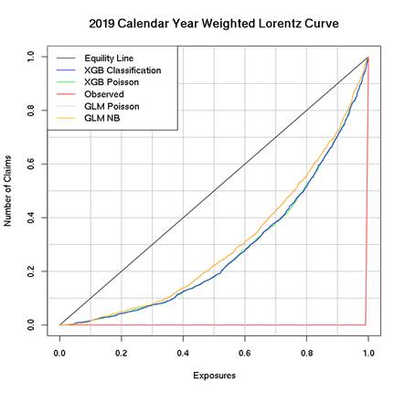
The Lorenz curve and Gini coefficient are classic tools developed in the early 19th century for studying distribution of income (or wealth) within an economy. The concept is also applicable to research other kinds of inequality in ecology, biology and business modeling: risk analysis and insurance portfolio theory.
The Lorenz curve is a graphical representation of two distributions related to each other. It was developed by Max O. Lorenz in 1905.
The Gini coefficient, developed by the Italian statistician
Corrado Gini in 1912, is the ratio of the area between the line of perfect
equality and the observed Lorenz curve to the area between the line of perfect
equality and the line of perfect inequality. The higher the coefficient, the
more unequal the distribution is. In the diagram, this is given by the ratio
A/(A+B), where A and B are the areas of regions as marked in the diagram.
|
|
|
|
If there was a perfect equality - if all policies had the same risk - 20% of policies or exposures would gain 20% of the total claims. In the Lorenz Curve , 20% of exposures have 5% of the claims and 90% of policies or exposures holds 55% of the total claims. |
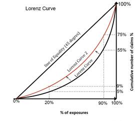
In this example, there has bean a reduction in inequality - the Lorenz curve has moved closer to the line of equality. 20% of policies or exposures now gain 9% of claims and 90% holds 75% of total claims. |
The Lorenz Curve helps to analyze the premium, loss and claims distribution based on the policyholder`s characteristics and give a visual overlook of the Insurance portfolio as a whole.
The line of equality can be interpreted as a ``break-even`` case for the insurer, where the percentage of claims equals the percentage of exposures. Curves below the line of equality represent a profitable situation for the insurer.
The classic Lorenz curve shows the proportion of policyholders on the horizontal axis and the loss on the vertical axis. But it can be ``weighted`` with exposures or number of claims.
The close Lorenz curve to the corner, the larger separation
between the distribution and therefore larger Gini index.
Now let`s take a look at XGBoost and GLM families models Lorenz Curves. The Gini index becomes larger as one uses a ``more refined`` model. XGBoost models are definitely more refined then GLM. This example shows not just predicted but observed curve since we have claims data for 2019. But with predicted risk, the insurances which had no previous claim history could be rated.
In this sense, insurers that adopt a model with a large Gini index are more likely to have a profitable portfolio.
R Code:
Models explanation, comparing and exploring
Note that the plots below just explain how the XGBoost model works, not necessarily how reality works. Since the XGBoost model is trained from observational data, it is not necessarily a causal model, and so just because changing a factor makes the model's prediction of claims go up, does not always mean it will raise your actual losses.
Feature Importance and interactions
Python code:
Final.6.
XGBoost - Feature Importance
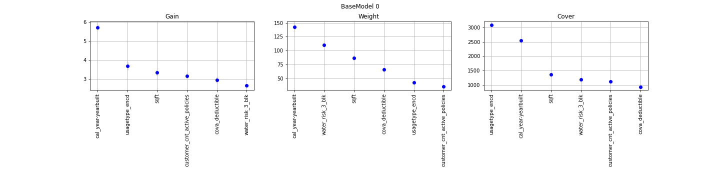
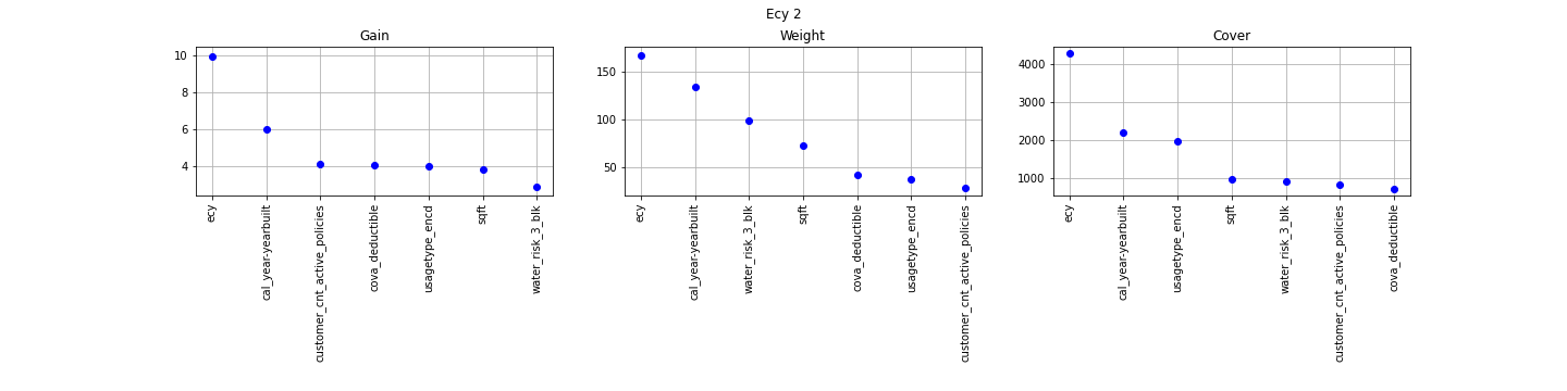
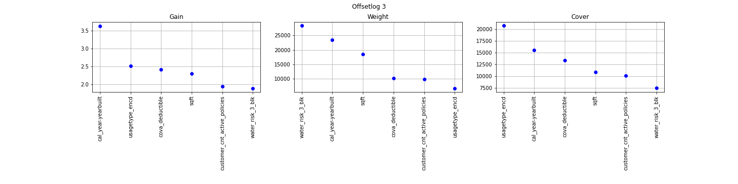
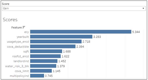
The concept is really straightforward: importance provides a score that indicates how useful or valuable each feature was in the construction of the boosted decision trees within the model. The more an attribute is used to make key decisions with decision trees, the higher its relative importance.
The Gain implies the relative contribution of the corresponding feature to the model calculated by taking each feature`s contribution for each tree in the model. A higher value of this metric when compared to another feature implies it is more important for generating a prediction.
The Gain is the most relevant attribute to interpret the relative importance of each feature. It is the improvement in accuracy brought by a feature.
The Coverage metric means the relative number of observations related to this feature.
The Weight is the percentage representing the relative number of times a particular feature occurs in the trees of the model. Continuous features with high number of possible values usually have a higher weight.
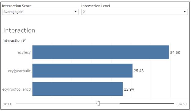
The standard XGB package provides only these 3 metrics for provided features. There is an other package available (XGBFi and XGBFIR) which provide more deep look for the feature importance. There are not just additional metrics but also analysis for combination of features - interactions.
- Gain: Total gain of each feature or feature interaction
- FScore: Amount of possible splits taken on a feature or feature interaction
- wFScore: Amount of possible splits taken on a feature or feature interaction weighted by the probability of the splits to take place
-
Average wFScore: wFScore divided
by FScore
-
Average Gain: Gain divided
by FScore
- Expected Gain: Total gain of each feature or feature interaction weighted by the probability to gather the gain
-
Average Tree Index
-
Average Tree Depth
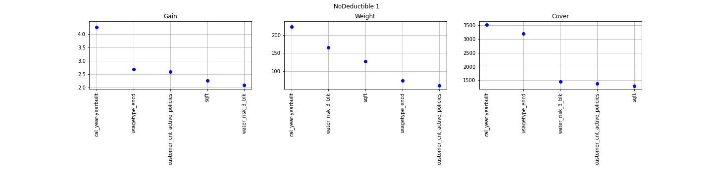
BaseModel0
Classification XGB (ecy as a feature)
XGBoost Poison Regression model with ecy as a feature
XGBoost Poison Regression model with natural log ecy as a base margin (offset)
GLM Coefficients
GLM models output is individual features coefficients which can be used to create rates in Insurance. Straightforward use the result of GLM models made them so popular.
|
Feature/mean
of coefficient |
Poisson
GLM ecy as a feature |
Poisson
GLM ecy as offset |
NB
GLM ecy as a feature |
NB
GLM ecy as offset |
|
|
(Intercept) |
-14.7506091 |
-14.7181685 |
-14.78155488 |
-14.7501997 |
|
|
cova_deductible |
-0.00031659 |
-0.00031637 |
-0.000317922 |
-0.00031776 |
The higher deductible the less
chance of a claim |
|
customer_cnt_active_policies |
-0.08427665 |
-0.08428232 |
-0.083533343 |
-0.08353935 |
LanLord Discount |
|
log_ecy |
0.96662095 |
|
0.965990676 |
|
|
|
log_property_age |
-0.02041777 |
-0.0204755 |
-0.02121951 |
-0.02128654 |
Negative means the older the house
the less chance of a claim. In fact, the dependency is not linear. It's
positive for yearbuilt. |
|
log_sqft |
0.70217589 |
0.702303219 |
0.705709955 |
0.706003098 |
|
|
log_water_risk_3_blk |
0.600811088 |
0.600819816 |
0.602341074 |
0.602466933 |
The higher Water Score the higher
chance of a claim |
|
usagetypePRIMARY |
2.629597933 |
2.614512181 |
2.628761053 |
2.613559038 |
|
|
usagetypeRENTAL |
2.30717875 |
2.292032954 |
2.306085903 |
2.290759414 |
|
|
usagetypeSEASONAL |
2.325590017 |
2.310574945 |
2.326357731 |
2.311289008 |
|
|
usagetypeSECONDARY |
1.410819814 |
1.396379834 |
1.412281881 |
1.397680983 |
|
|
usagetypeUNOCCUPIED |
-6.81951097 |
-6.56081601 |
-10.81987093 |
-11.7611959 |
Discount on unoccupied or vacant
properties |
|
usagetypeVACANT |
-2.62434632 |
-2.57748907 |
-3.424345503 |
-3.37748863 |
GLM models coefficients
Partial Dependency Plots
Python code:
-
Final.5.1.
XGBoost Frequency ecy as a feature - Partial Dependency
-
Final.5.2.
XGBoost Frequency ecy as a bm - Partial Dependency
-
Final.5.3.
XGBoost Severity - Partial Dependency
AWS Sage Maker with parallel execution of many models makes
Partial Dependency plots creation much faster:
06. AWS Sagemaker XGBoost Partial Dependency.ipynb
Partial Dependency plots show the partial effect of a feature on the predicted outcome. Basically, it`s an output of the model from just one predictor. It can show whether the relationship between the target and a feature is linear, monotonic or more complex.
The most interesting is Property Age (Calendar yare – YearBuilt) partial dependency plot.
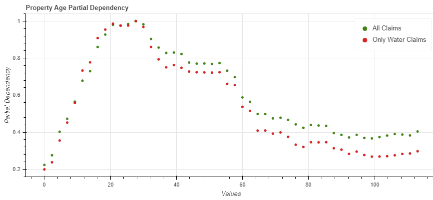
Property Age partial dependency plot
Shap Values
Python code:
-
Final.7.
Frequency Shap Values - XGBoost Classification and Poisson
-
Final.7.1
Frequency Shap Visualization - XGBoost Classification and Poisson
-
Final.7.2
Severity Shap Visualization - XGBoost
-
Final.7.4
Severity Shap Values - XGBoost
-
Final.7.5
Frequency Shap Values - XGBoost Classification BaseModel0 and BaseModel1
AWS Sage Maker
07. AWS Sagemaker XGBoost Batch Transform with ShapValues.ipynb
The average prediction for all policies is 0.07 as an example. A policy prediction is 0.03 which is less then the average. The question is how much each feature value contributed to the policy prediction comparing to the average prediction?
The answer is simple for linear regression models like GLM. The effect of each feature is the weight of the feature times the feature value. This only works because of the linearity of the model. For more complex models like XGBoost it is not so straightforward, and we need a solution. That`s why GLM models is adopted by actuaries and XGBoost models are prohibited.
A prediction can be
explained by assuming that each feature value of the instance is a ``player``
in a game where the prediction is the payout. Shapley values - a method from
coalitional game theory - tells us how to fairly distribute the
"payout" among the features.
We replace the feature
values of features that are not in a coalition with random feature values from
the dataset to get a prediction from the model.
The Shapley value is the
average marginal contribution of a feature value across all possible coalitions.
SHAP values show how much each predictor contributes, either
positively or negatively, to the target variable.
Each observation gets its own set of SHAP values. They are
the base for individual plots per observation with explanation of the prediction,
summary plots for feature importance (average the absolute Shapley
values per feature across the data) and even interaction dependencies plots.
The available Python package can produce Shap Values for XGBoost Classification and Regression models. It does not work for models with base margin. There is an R package for GLM models (IML) but it does not produce any result for my models working for days. It`s too slow or needs more configuration. Since GLM models are self explainable anyway with coefficients I stop trying produce Shap values for them.
Individual Observation Shap Value Plot
The plot produced from the package in Python
Example of a prediction with low chance of a claim: short exposure, vacant (usagetype_encd=4) and small property

High chance of a claim: long
exposure, low deductible, high water score
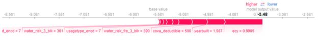
Still high chance of a claim despite high deductible. In this case the drivers of the high probability of a claim are limit and sqft, elevated water score, occupied property.
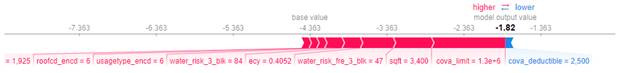
(The screenshots are from the output of different models)
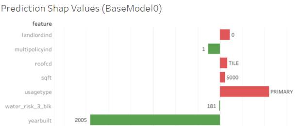
The base value or the expected value is the average of the model output (the average of the prediction from full dataset 2009 -2020). The units are log odds ratios, not a probability from the model output. Large positive values mean a higher chance of a claim and large negative values mean a lower chance of a claim.
Red/blue: Features that push the prediction higher (to the right) are shown in red, and those pushing the prediction lower are in blue
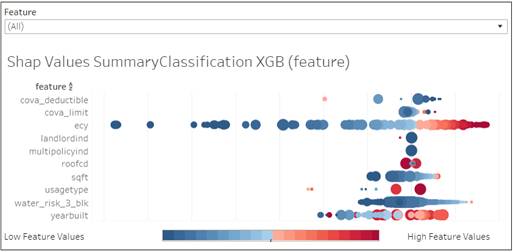
Summary Shap Values plot
The summary plot combines feature importance with feature
effects. Each point on the summary plot is a Shapley value for a feature and an
observation. The position on the y-axis is determined by the feature and on the
x-axis by the Shapley value. The color represents the value of the feature from
low to high. Overlapping points are jittered in y-axis direction, so we get a
sense of the distribution of the Shapley values per feature. The features are
ordered according to their importance.
There is a big difference between feature importance from XGBoost
model and Shap Values feature importance measures: the first one is based on
the decrease in a model performance. SHAP is based on magnitude of feature
attributions.
The color represents the value of the feature from low to high.
The size represents the number of observations with this feature. Larger
positive values mean a higher chance of a claim and large negative values mean
a lower chance of a claim.
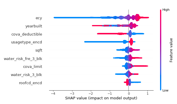
Features with large absolute Shapley values are more important:
exposures, yeatbuilt, deductible, usage.
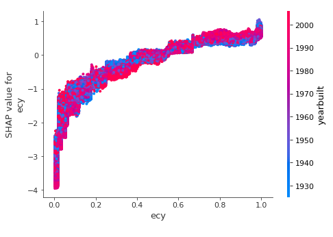
Shap Value Dependence Plot
This plot is very similar to a standard partial dependence plot, but it provides the added advantage of displaying how much context matters for a feature (or in other words how much interaction terms matter). How much interaction terms effect the importance of a feature is capture by the vertical dispersion of the data points.
The higher the exposure, the higher chance of a claim. But in a case of old houses (blue) it`s lower versus more modern (red) where the chance is higher.
These plots were not transformed into Tableau dashboards.
Process and Tools used
Modeling data are updated daily in Redshift via our regular ETL process.
The data in the project are static. An SQL query was run to extract and partially transform property modeling data and downloaded via S3 into the local system.
Python and R code were run locally or in AWS SAgeMaker to create csv files with predictions, Shap Values, feature importance, partial dependencies etc. The data were loaded back in Redshift and Tableau dashboards were built.
AWS SageMaker
AWS tools can automate the entire process from extracting training data to analyzing the predicted results.
AWS SageMaker creates powerful instances on a fly to train models and then predict in parallel to speed up the whole process. The instances exist and paid for only for the time needed for modeling or transforming data. It can take few minutes or several hours.
Amazon SageMaker batch transform and training jobs can process bulk inputs directly from S3 (easily extracted from Redshift or Aurora via SQL) and store predictions back to S3. The data can be loaded into Redshift or analyzed directly in S3 with Tableau and Amazon Anthena connector.
The process (Python or R script) can be run on a local machine, EC2 instance or SageMaker notebook.
· If it requires moving data from S3 to a memory for further processing and the machine is a local one, we pay for the data transfer.
· If we work inside AWS using EC2 instance or SageMaker notebook we pay for the instance in addition to the instances created for modeling or prediction.
If we need less then 5 minutes to train a model or predict, no need in SageMaker. It requires minimum 5 minutes to create an instance and we can not reuse the same created instance for modeling to predict the data. They are different jobs.
But if the process takes longer then we can save several hours using SageMaker features. The examples of such processes are creating partial dependencies and Shap Values for prediction. Both processes need to predict all possible combinations of input data and the volume of the data is huge.
Python or R code used for training models and prediction in AWS SageMaker requires knowledge and understanding how AWS works. SageMaker frameworks do not cover everything what is needed and only Boto3 SDK allows to cover the gaps. The documentation is weak and, in the opposite to traditional approach, you hardly can easily google what you need.
Amazon SageMaker supports two ways to use the XGBoost algorithm:
· XGBoost built-in algorithm
· XGBoost open source algorithm
The main problem of built-in algorithm is a stale version. The open source XGBoost typically supports a more recent version. I also did not find a way to return Shap Values along with prediction using built-in XGBoost. However, using the built-in algorithm version of XGBoost is simpler than using the open source version, because you don’t have to write a training script.
Process of the research
Numerous experiments were conducted to research models
performance based on different set of features or hyperparameters. The same
code was run for different experiments over and over again with changes in the configuration.
It`s important to keep together everything related to an experiment (data file
used, feature set, target, model parameters, model score, feature importance,
partial dependency data, model files) to be able to analyze and reproduce the
results. I used to and like Excel files to save experiment logs and it`s enough
for me as an individual researcher.
Experiments were configured in an Excel file. The code reads the configuration and runs AWS Sage Maker jobs in parallel or local code. Results are read from AWS Sage Maker experiments, S3 files or local files and added to Excel files (local experiments logs).
Type of experiments and used code:
-
Parameters and/or Features (original from a
dataset or calculated) sets impact on a model score
Deep models comparison using native XGBoost CV " 03.AWS
SageMaker XGBoost Training Models using native CV for cross validation
Experiment (Features and Parameters research).ipynb ". The number of
parallel training models is limited only with your AWS account settings. I ran
30 models in parallel adding new models dynamically when one of the running
model complete. Corrected t-test for validation data and t-test are conducted
at the end. XGBoost CV is extended to extract and save a best model and folds
metrics. This additional information is stored in output.tar.gz
Training and cross validation can use a standard XGBoost evaluation metric (ROC-AUC, NLogLik) or custom (gini). Each experiment run returns train/valid errors to estimate overfitting. There is an option to extract feature importance if needed and perform prediction and validation on test data. Standard errors of the mean and standard deviation are returned and analyzed along with cross validation metric.
Locally run code which performs the same task can be found
in 03.Local
XGBoost Training Models using native CV for cross validation Experiment
(Features and Parameters research).ipynb. The code related to reading
experiment configuration and training models exist and can be run as Python
code, not notebook in background because it may take hours to complete - LocalXGBoost.py
.
-
Partial Dependency from AWS SageMaker XGBoost
model - 06.
AWS Sagemaker XGBoost Partial Dependency.ipynb .
-
Inference
with Shap values 07.
AWS Sagemaker XGBoost Batch Transform with ShapValues.ipynb .
-
08.
AWS Sagemaker Experiments Cost.ipynb calculates costs of an experiment based on the
registered jobs and used instances.
- 09.AWS Hyperparameter Tuning job for XGBoost Classification.ipynb uses training individual models or cross validation (XGBoost CV) with standard or custom evaluation metrics. Works for any XGBoost, not just classification.
Log Excel files with experiment configuration and results:
Tableau dashboards
There are 2 types of dashboards in the workbook:
- Portfolio and individual policies analysis
- Models exploring and comparing
For the first part I choose 4, most informative models from my point of view:
1. BaseModel0 - XGBoost Classification based on only risk attributes, not including exposure or policy attributes like deductible and limit. The model has low accuracy but highlights when a policy has a high risk property vs a risk from a long exposure or low deductible
2. BaseModel1 - XGBoost Classification based on only risk attributes and policy attributes (deductible and limit). The model has slightly higher accuracy and shows if a policy risk comes from property risk and low deductible. Together with BaseModel0 and BaseModel1 we can conclude where is the risk from.
3. Classification XGB (feature) - XGBoost Classification with exposure added into the feature set.
4. Poisson XGB (feature) - Poisson Regression XGBoost with exposure added into the feature set.
The last 2 has almost identical accuracy. Which one is the better is discussed in the last section.
The other models do not have enough accuracy (GLM) or can not be explained with Shap Values producing almost the same results like 3 and 4 (XGBoost base margin).
The dashboards require a lot of detailed data. The workbook is huge and slow.
There are a lot of data presentations based on a sort order which works not very stable.
Portfolio analysis
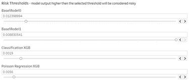
In general, the higher the model output the more risky the observation. Absolute prediction for each observation is on its own scale for each model. So 0.017 in one models is something different in an other. Instead of the absolute value I base the report on the rank of each prediction. The rank is dynamically calculated based on the data filtered by Calendar Year, Carrier, Company, State, LOB, Policy Form, Territory, Agency Group and Producer. The report shows the best and the worse policies based on the prediction rank in the selected data set.
The higher the risk of a claim the lower the rank. In this way we can select first 10 or 200 worse policies.
Model filter allows to sort out policies according to a specific model prediction. A special ``level of risk`` filter regulates how many policies we want to review.
The other specific filter is Mid-Term drop down. It makes sense only for 2020 and 2021 calendar year. It allows to show only future or current exposures.
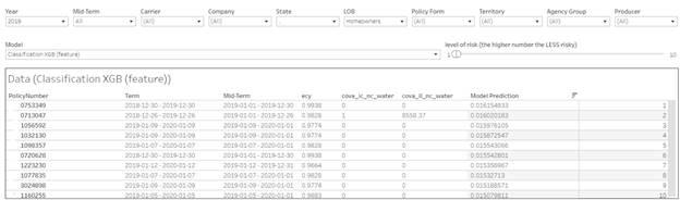
The additional information is available when you hover the mouse over the rank in the report.
For 4 most important models I provide Yes/No Risk. It`s ``Yes`` if the model output above a threshold and ``No`` if it`s below the threshold. The threshold initial value is an average of a model prediction for all dataset. But it can be adjust using the filters on the page
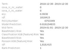
Shap Values plot
Clicking on a policy highlights the plot in the bottom part.
Red, large positive values mean a higher chance of a claim and green, large negative values mean a lower chance of a claim. The calculation base - the expected value is the average of the model output (the average of the prediction from full dataset 2009 -2020). The units are log odds ratios, not a probability from the model output.
Individual Policies Analysis
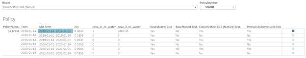
The dashboard allows to enter the exact PolicyNumber. There is no Risk levels because it`s just about one policy and the level is only defined relatively to other policies in the set. Instead, there are Yes/No Risk output from each model.
The output is all mid terms changes for a policy. BaseModel0 is the same for all mid-term changes and highlights how many risk is coming from a property itself. BaseModel1 can be different for different terms or even mid-term changes if CovA Limit or Deductible were changed. The other two models are depend on exposure.
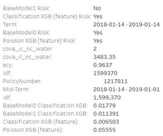
Hovering the mouse opens an additional information with exact model prediction
Portfolio Analysis with Lorenz Curve
Portfolio Analysis with Lorenz Curve is a dynamic report where you can select a specific portfolio based on the standard policy filters like LOB/State etc. In addition, there are dynamic parameters to build the curve itself: Sorted By specific model results, Y and X (weight) axe distributions.
Unfortunately, Tableau can not combine 2 or more Lorenz
Curves from different portfolios or sorted by different models to compare in
one chart.
![]()
![]()
Hovering the mouse over the curve provides the important numbers: 60% of
exposures holds 33% of claims.
Models exploring and comparing
The other dashboards in the workbook allows to explore and compare the models using feature importance plots, interactions, partial dependency and summary Shap Values plots for XGBoost models and coefficient estimation for GLM models.
The dashboards build in a way to combine all info available for a specific model or compare a similar info for different models. They are combined in a story.
XGBoost Models
Explore
The dashboard contains all info for a selected model.
It allows to compare feature importance standard metrics from XGB package and interaction scores from XGBFIR package for one model.
The other interesting comparison is Shap Value summaries importance plot and partial dependency plot. Both describe the model output / feature importance depending on a feature value with different level of details.
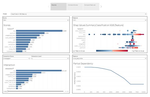
Model Score
This is visualization standard feature importance metrics from XGB package. The dashboard allows selecting a specific metric.
Interaction Score
Interactions importance are
represented in Tableau dashboard as an ordinary bar charts. You can select a
model, a metric and interaction level. The list of interactions can be huge and
you can filter out not important interaction with the score range below.
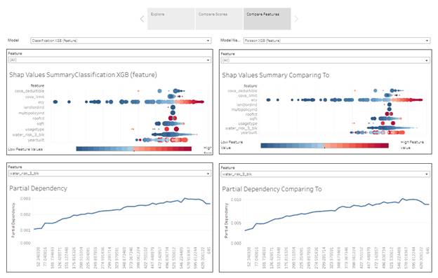
Shap Values Summary Plot
The dashboard allows to review all features all together or select just one to review it in more details and compare to the same feature selected in Partial Dependency plot.
The color represents the value of the feature from low to high. The size represents the number of observations with this feature. Larger positive values mean a higher chance of a claim and large negative values mean a lower chance of a claim.
Partial Dependency Plot
Partial Dependency plots show the partial effect of a feature on the predicted outcome. Basically, it`s an output of the model from just one predictor. It can show whether the relationship between the target and a feature is linear, monotonic or more complex.
The plot is per specific feature. The interesting observation can be done when the same feature is selected in Shap Vallue Suumary plot and in the dependency plot.
Comparing Scores between different models
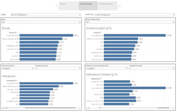
Comparing Features between different models
GLM Models
The tables in the dashboard allows to compare coefficients and scores from different GLM models. The interesting exercise are to compare individual features and features values coefficients with partial dependency and Shap Values summary plots in XGBoost models. Ideally, they should show the same kind of dependency in all models. It maybe not so straightforward in GLM coefficients if the dependency is not linear like in yearbuilt.
Conclusion
Data
The existing modeling data view does not work for the future dated exposure prediction. There are only training and testing data. Since there are a lot of data conversion in the view and the process is error prone, it`s better to create an other view, specifically for this kind of models.
Auto modeling data needs even more adjustments for the exact drivers from claims. Current data use assigned driver from policy data.
Models
Frequency
The relationships discovered by the model are more related to claims in ``general`` then specifically to the water perils. The most important features are exposures, yearbuilt (or property age), usagetype, deductible. Water score (water_risk_3_blk) is somewhere at the end of the list.
GLM models has less accuracy then XGBoost models. Despite the fact, they produce feature coefficients which can be used in the rating process directly, they hardly can provide clear insights for the prediction of a specific observation. There is a way to produce Shap Values but it`s almost impossible.
XGBoost models have relatively similar accuracy and it`s higher then in GLM models.
Poisson Regression with exposure as a base margin can play the same role as Poisson GLM if it could produce coefficients. Because it can not produce coefficients, this type of models is considered as a black box for actuaries and is not allowed to be used in the rating process.
Neither Poisson Regression XGBoost nor Classification XGBoost with exposure as a base margin can produce Shap Values for better insights in the model process. Using base margin is not very well documented and rare used.
All together makes this kind of models useless.
Classification XGBoost and Poisson Regression XGBoost have comparable accuracy. XGBoost Logistic Regression predicted probability like score should be calibrated to compare with individual probabilities from Poisson Regression.
However, you should not expect Poisson regression XGBoost (or GLM) models will produce number of claims per exposure as an integer. The predictions are still a very small decimal numbers as in Classification models output, due to the very low level of claims in the data.
Classification XGBoost works faster and is more robust and documented. Prediction generated from XGBoost classification is not a probability. It’s a probability like score and require calibration if probability is needed.
If we do not want exposures impact the result, Classification XGBoost is the only choice.
Severity
Severity models accuracy is very low in all models types. It maybe due to the small number of claims, missing some important attributes or adjustments of losses.
Models explanation and Tableau dashboards
Shap Values provides human interpretable explanation of models output ``how much``. The black-box , XGBoost models are, in fact, more explainable than GLM. The answer ``why`` makes the models are more trustable.
Explaining each observation or, at least, most interesting observations, in Python or an other script does not work well because it`s require master-detail view, search and filtering. The natural choice is a reporting application.
The approach works much better in Tableau but it is not also very straightforward to the point I start thinking we need something else then Tableau:
- The plots from Python package needs to be translated into the reporting system. Some information can be transformed as is, but something is lost.
- There are 2 million of observations in property modeling data, 7 models producing Shap Values and 5 cv-folds in each. Everything together makes 70 million Shap Values records. Also take into account, we need to keep 50+ data fields for each observation which makes first 2 million table not just long but also wide.
- The problem with transforming Shap Value plots into Tableau is additional transformation. Instead of a table with 70 million records and 10 columns for each feature Shap Value, Tableau plots need one feature Shap Values in each row. I do some averaging extracting less data, but some info is lost too.
- Tableau is not very good with plain tables without aggregation, and this what I tried to build to produce the result of prediction from different models and attributes.
This huge amount of detail data needed in Tableau makes the workbook huge and requires a lot of memory for desktop Tableau version for development. The development is very slow. The final dashboards are slow even in the server environment.
The other problem is sorting. The plots and tables in Tableau dashboard are based on specific sorting. For whatever reason, the sort order is unstable and lost with changing in filters. Maybe the amount of data is the reason.
Overall, the approach is suitable for a business application with some limitations. We need to choose just 1 or 2 models per workbook, average everything what`s possible, separate policies by something (LOB?) in different workbooks.
Lorenz Curve plot is very complex with table calculation, require a lot of detail data and it`s based on sorting order which is unstable.